Continuity provides the ONLY storage & backup security solution for real data protection. They automatically detect and fix all security risks – to harden your storage & backup systems against ransomware.
The combination of the hand and the eye creates a powerful image that suggests that Continuity Software is a company that can help businesses to protect themselves from disruptions and keep their operations running smoothly. It is a logo that conveys a sense of trust, reliability, and confidence.
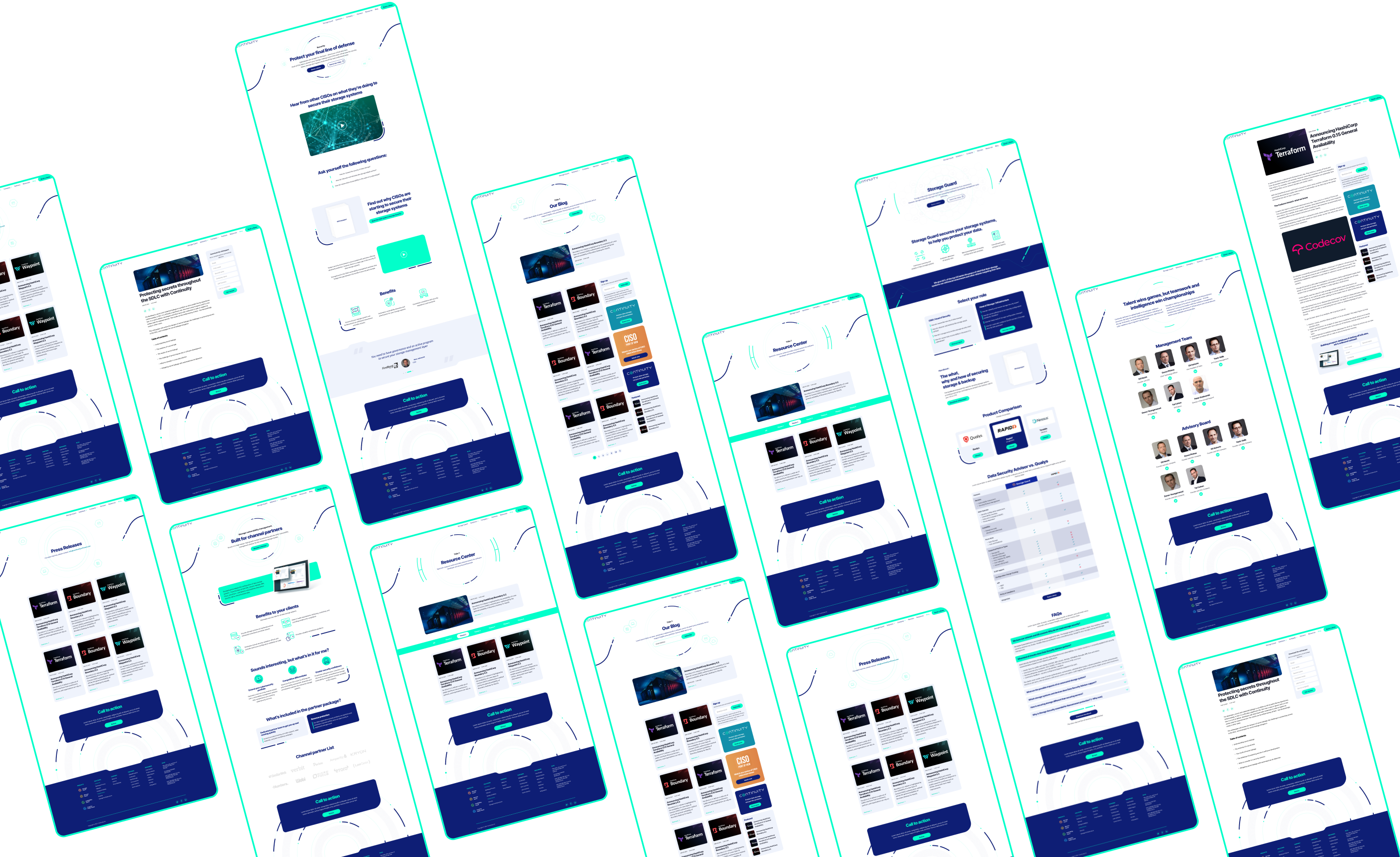
Current Design Challenges
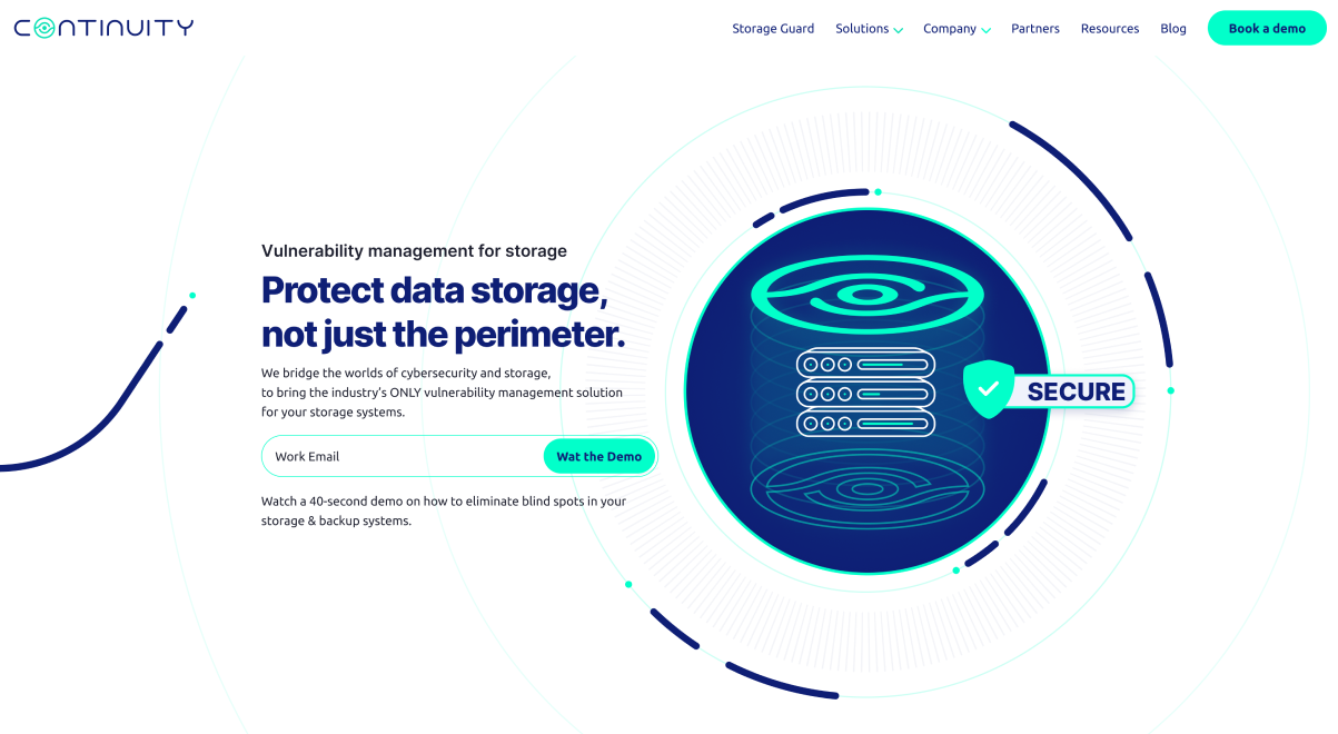
Communicating the company’s expertise. Continuity Software is a complex and technical field. The design of the brand and website communicate the company’s expertise in a way that is clear and concise. The design also visually appealing and engaging so that client will want to learn more about the company.
Icons
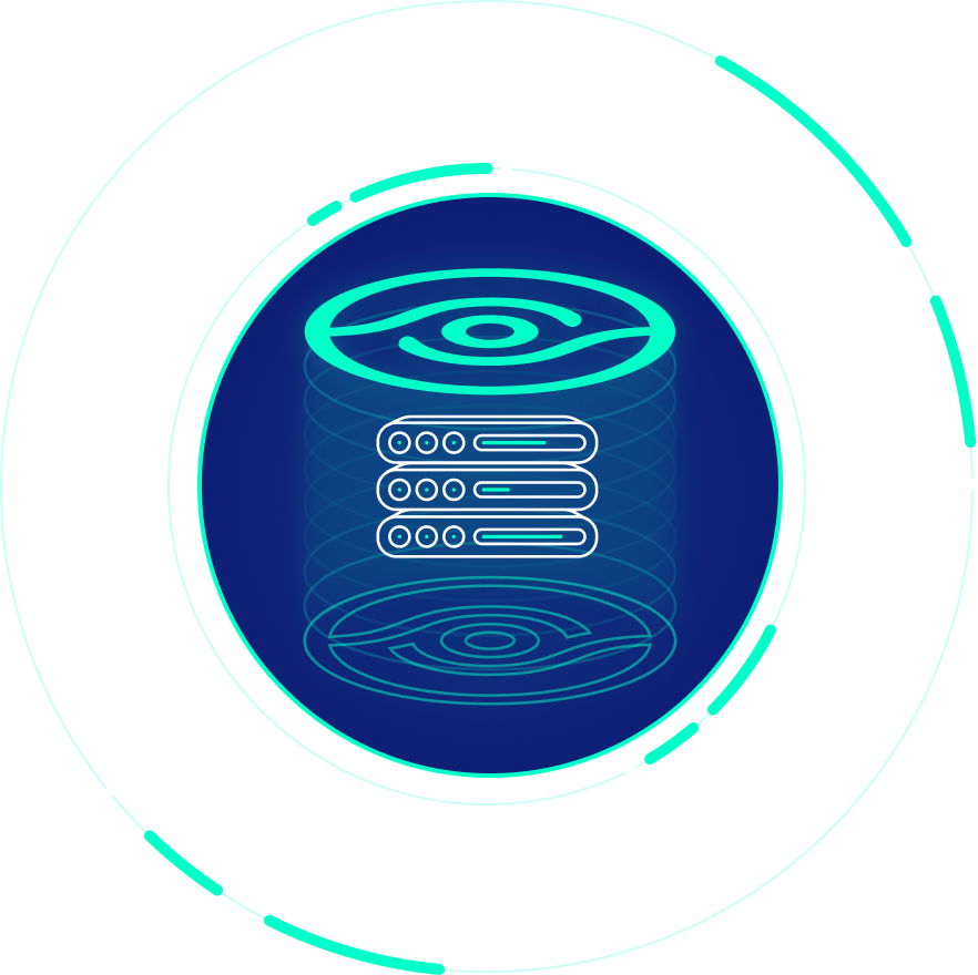
The icons on the Continuity Software website are designed to be simple, clear, and easy to understand. They are also designed to be consistent with the overall design of the website.
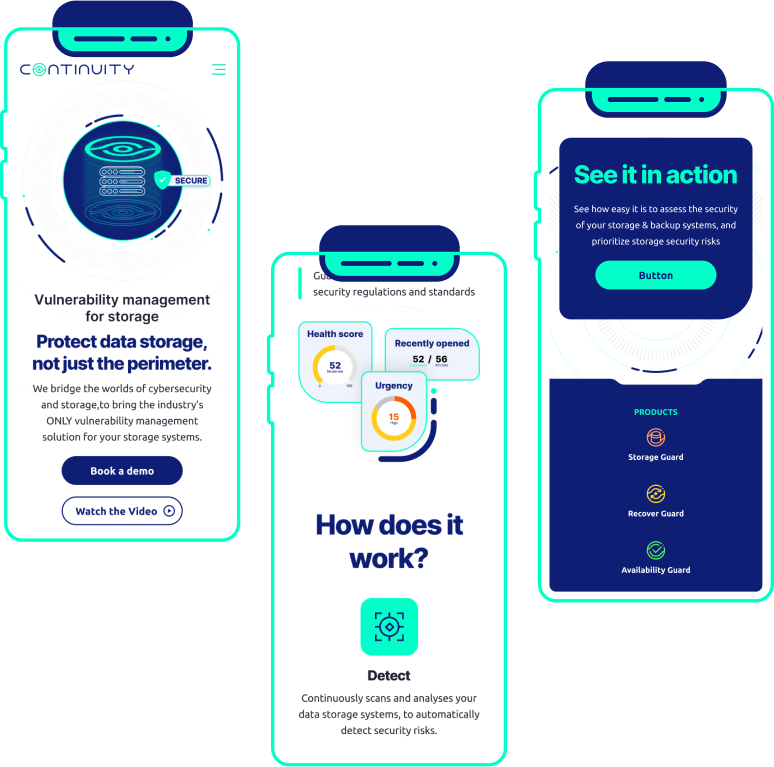
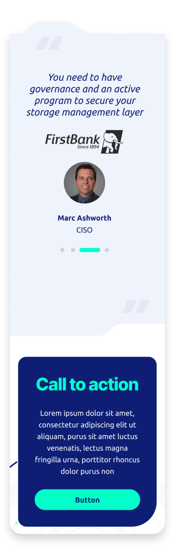
Mobile-Friendly UI
The mobile UI is also designed to be intuitive and easy to use. The menus are clearly labeled and the buttons are large and easy to tap. The website also uses a lot of white space, which makes it easy to focus on the content.
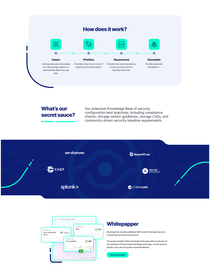
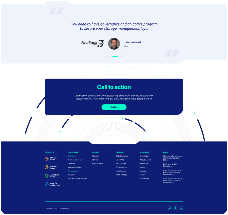
Branding that Continues All the Way
The branding on the Continuity Software website is well-executed and effective. It helps to create a cohesive and consistent user experience, and makes the website easy to use and navigate.