
Brand Strategy
Three brand mistakes that make hi-tech companies look small
·3 min read·Igal Melamed
Updated
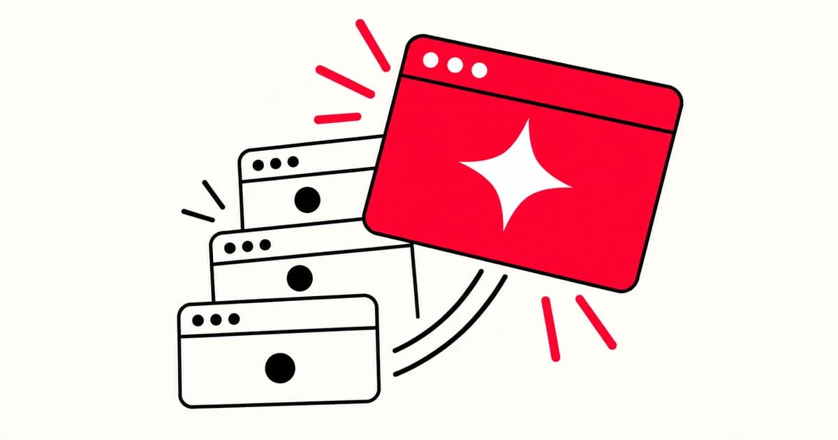
After eight years branding cyber, security, and SaaS companies, the same three identity problems show up at series-A and series-D alike. They look small in isolation, but together they tell every enterprise buyer that you're new at this.
1. The category-blue trap
Open any DevSecOps competitor page. Count the shades of blue. Now look at yours. Blue is a familiar choice in technology branding, but familiarity alone is not a reason to choose it for your company.
The mistake isn't blue itself. It's that you've adopted a category default without earning it. Spectral is the example we keep going back to - they chose vivid purple in a sea of corporate blue, and the brand instantly read as confident, distinctive, and developer-friendly. The visual project illustrates differentiation; it does not establish that design caused or contributed to a business acquisition.
If you can't justify your color in one sentence that doesn't mention "trust," you don't have a color. You have a category default.
2. The "we do everything" homepage
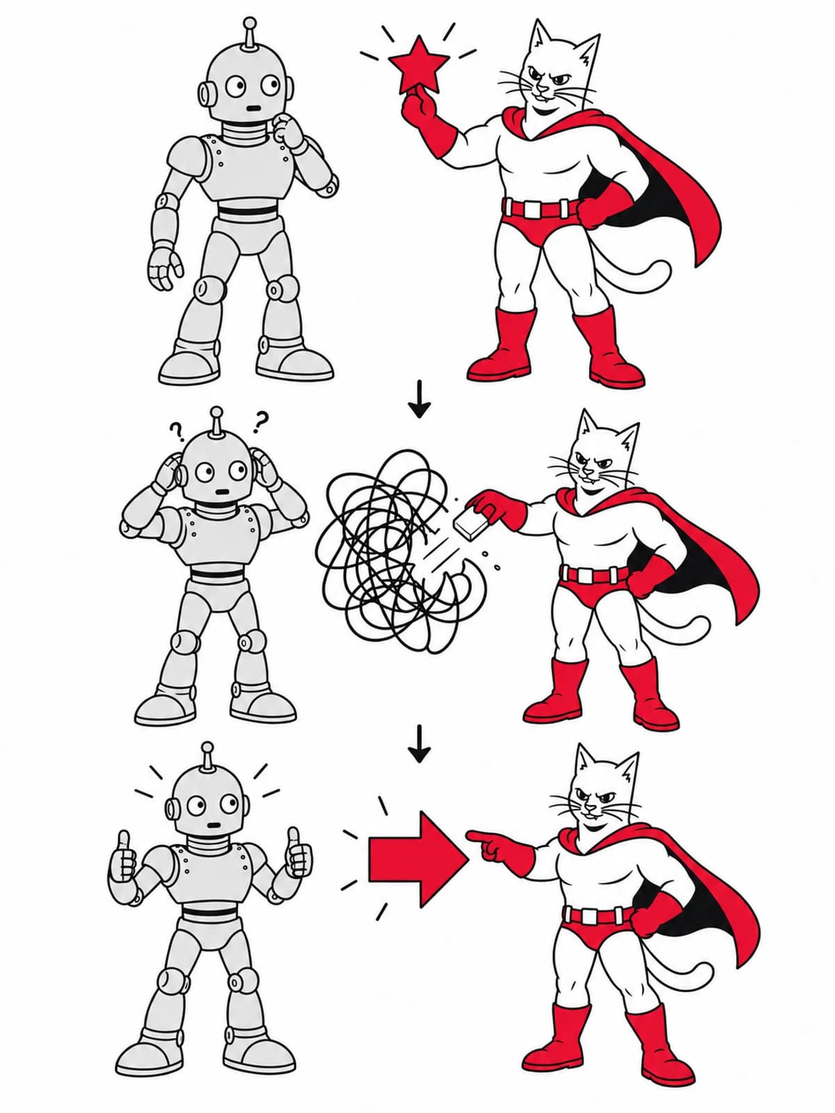
Hi-tech founders love their product. So they want the homepage to explain all of it: the platform, the API, the integrations, the security model, the roadmap, the case studies, the awards, the team.
The result is a homepage that says nothing.
The fix is editorial, not visual. Pick the single sentence that an enterprise buyer would screenshot to send to their CISO. Lead with that. Everything else is below the scroll, in case studies, on the docs site.
A clearer primary job gives the team a more focused hypothesis to test with users and conversion data.
3. Pricing without context
There's a category of B2B hi-tech sites that hide pricing entirely ("Contact sales") and a category that publishes a wall of tiers nobody understands. Either approach can create friction when it leaves buyers without the context they need.
One option is a clear description of scope and the factors that affect the quote, with a budget range if the business can maintain it accurately. The buyer understands the order of magnitude, self-qualifies in or out, and you spend zero hours on calls with companies whose budget is half your minimum.
Pricing transparency isn't about publishing rate cards. It's about respecting the buyer's time enough to let them know if they're in the right room.
If your brand makes any of these three mistakes today, the fix is rarely a redesign. It's an editorial decision - what to remove, what to commit to, what to say first. We've found that the rebrand-first impulse is almost always wrong; the messaging-first fix is almost always right.
Continue exploring
Explore our branding and UX/UI services, see the Spectral brand project, or read Brand guidelines vs. design systems.